


By Inna Cintina and Natalie Schack
The gender pay gap gets a lot of attention, but what can we learn about it by looking at the wage data?
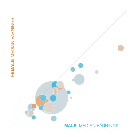
The Hawaii Equal Pay Dashboard compares female salaries to male salaries over time. It breaks up the workforce into a few dozen occupation groups, and uses American Community Survey (ACS) data from 2005-2012 to try to get a glimpse into our state’s state of gender wage equality. The data however, presents a picture that’s fuzzy and misleading to say the least. But it also helps to illustrate the complicated reality of wage inequality visualization.
For example, looking at the ACS median wage data we see that there are substantial differences across genders within the same occupation. However, the real big questions are: are these big differences really there? Do men in Legal Occupations really make 171% more than women in the same occupation? And do women really make 18% more than men in Installation, Maintenance and Repair Occupations?* The answers are not straightforward and are much more complex, a testament to the multi-faceted – and sometimes misleading – nature of data.
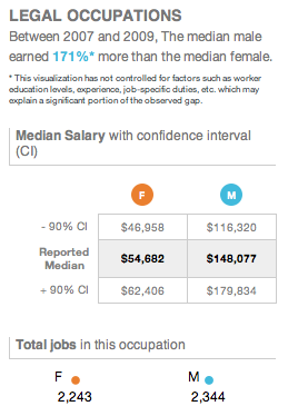
First of all, the ACS’s median wages for men and women are just estimates and the precision of these estimates varies across occupations. To produce an estimate, the ACS surveys a sample of housing units and people in the population, not the entire population. That’s why in addition to the median estimates, the ACS provides a 90% confidence interval, which is a statistical measure that reflects a degree of uncertainty around this estimate. The larger the confidence interval, the lower the precision of that estimate and the lower confidence we have that this estimate is close to the true value. For example, in the case of male salaries for Legal Occupations for the 2007-2009 aggregate, that confidence interval spans $116K – $180K, a huge range. It means that there is a 90% chance that the median wage falls within this range, but we’re not quite sure what exactly the median male in the legal profession earns.
Imagine telling someone that the geographically average person in the continental US lives in Chicago… but with a confidence interval that extends east to New York City and west to Los Angeles. What would we actually know about the way the population is distributed? It’s difficult to tell, to say the least.
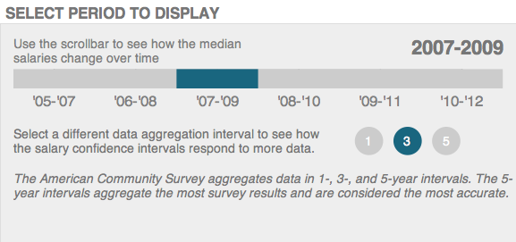
The size of the confidence interval is affected by the quality and the amount of data collected. One way the ACS is able to produce more accurate estimates for occupations with a small number of workers is by aggregating survey data over several years. Check out how the one-year aggregation data picture (data from just one individual year) compares to the three- or five-year aggregation data pictures (data created by averaging the results from clusters of three or five years, respectively). The confidence intervals narrow as more time periods are aggregated and more data are included in the estimate’s calculation. However, interesting characteristics of individual years are lost in the aggregation process.
Complicating things even further is the issue of important pieces of information not shown in this particular data view. An array of important factors such as education levels, experience, training, industry, job specific duties, and so on affect wages and can all affect this data-drawn picture of the state of equality. In a way, a comparison of the median wages within the same occupation without accounting for differences in qualifications, employment industry, and other factors that are responsible for differences in wages is like comparing papayas to taros.
The takeaway? While a glance at the tilt of the visualization gives us the impression that the data does seem to be skewing wages in the favor of men, the bottom line is that things might not be what they seem. To be able to make an accurate conclusion, the reader should be paying attention to what is displayed, and recognize the fact that visualizing equality is complicated. An enormous amount of additional information would have to be included in a visualization such as ours for it to really be able stand a chance at tackling the gender equality question in a meaningful way.
How do your real life experiences with the issue gender and wages in your occupation group compare? What other information would help you in understanding this issue better?
*This data is from the 3-year aggregate level for the years 2007-2008.
BLOG POSTS ARE PRELIMINARY MATERIALS CIRCULATED TO STIMULATE DISCUSSION AND CRITICAL COMMENT. THE VIEWS EXPRESSED ARE THOSE OF THE INDIVIDUAL AUTHORS. WHILE BLOG POSTS BENEFIT FROM ACTIVE UHERO DISCUSSION, THEY HAVE NOT UNDERGONE FORMAL ACADEMIC PEER REVIEW.